
If you’ve practiced polyamory or ethical non-monogamy for any period of time, you’ve probably wondered just how tangled your situation really is – especially as your polycule and polyamorous community grow. Are you in a triad, a square, or a polyhedron? How far do your polycule’s branches extend, and where do they reconnect?
Depending on how far you’ve let your curiosity take you down this rabbit hole, you may have used one of the tools available online specifically for mapping polyamorous relationships.
About a year ago, one of my anchor partners and I pondered this question. The two of us, plus each of our other anchor partners, were all active in various Venn diagrams of Los Angeles communities that overlapped with polyamory. You know, the usual suspects – art, D&D, board games, Burning Man, LARP, kink, the SCA. (We’re just a bunch of nerds.) Just how complicated and interconnected was our polycule? Did we expand like an orb or circle back in on ourselves like an ouroboros?
My partner created a 2-dimensional graph using the free graphing app yEd, available on both Windows and Mac. He started with his own knowledge of his polycule, including his current and past partners and their partners out to about three degrees from him. Then we added my knowledge – and once I got my own copy of the file, I ran with it.
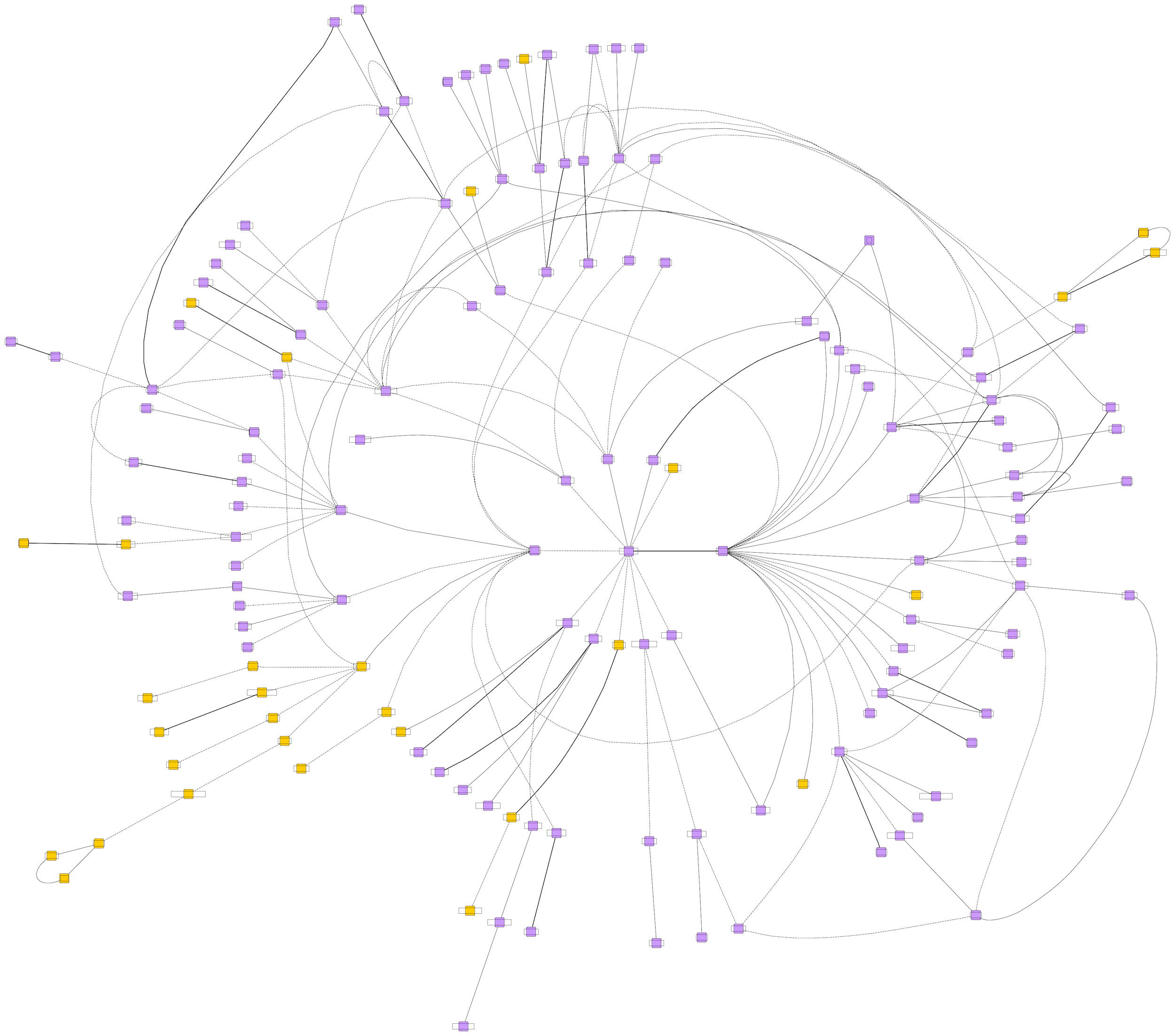
I don’t put in a lot of effort actually keeping up with the graph. Occasionally, I remember that it exists and make edits based on whether anything has changed to my knowledge. The graph grew significantly when I showed it to a small group of close friends from the same communities, who filled in a lot of the blanks up to about six degrees from me.
By no means is this a serious project, just something we asked whether we could do without considering whether we should – and now we’ve got over a decade of communal social history between these nodes and lines. At a certain point, the greater polycule map feels like a trove of Forbidden Knowledge. You know, the kind some ancient wizard buried in a cursed dungeon (heh) with an enchanted lock that can only be opened by a long-lost incantation after getting through a gauntlet of traps and a cave troll to keep it secret, keep it safe.
All of the information on our polycule map was either public knowledge or volunteered by people involved in those relationships. And yet, when it’s all put together, it’s a bit awe-inspiring. When I first unveiled the graph with names included to a small group of close friends, a hush fell over the room. Some of those dashed lines were amicable breakups, but certainly not all of them. That’s why I like to say that the graph comes with spice built in. It’s also why I only record first names and last initials and always anonymize the graph before sharing it.
I am not a data scientist in any capacity, and I recently learned just how far the rabbit hole goes when it comes to graphing and data visualization. But I did play around a little bit with the graph to see what I came up with – and I tracked down some 3D graphing software, too.
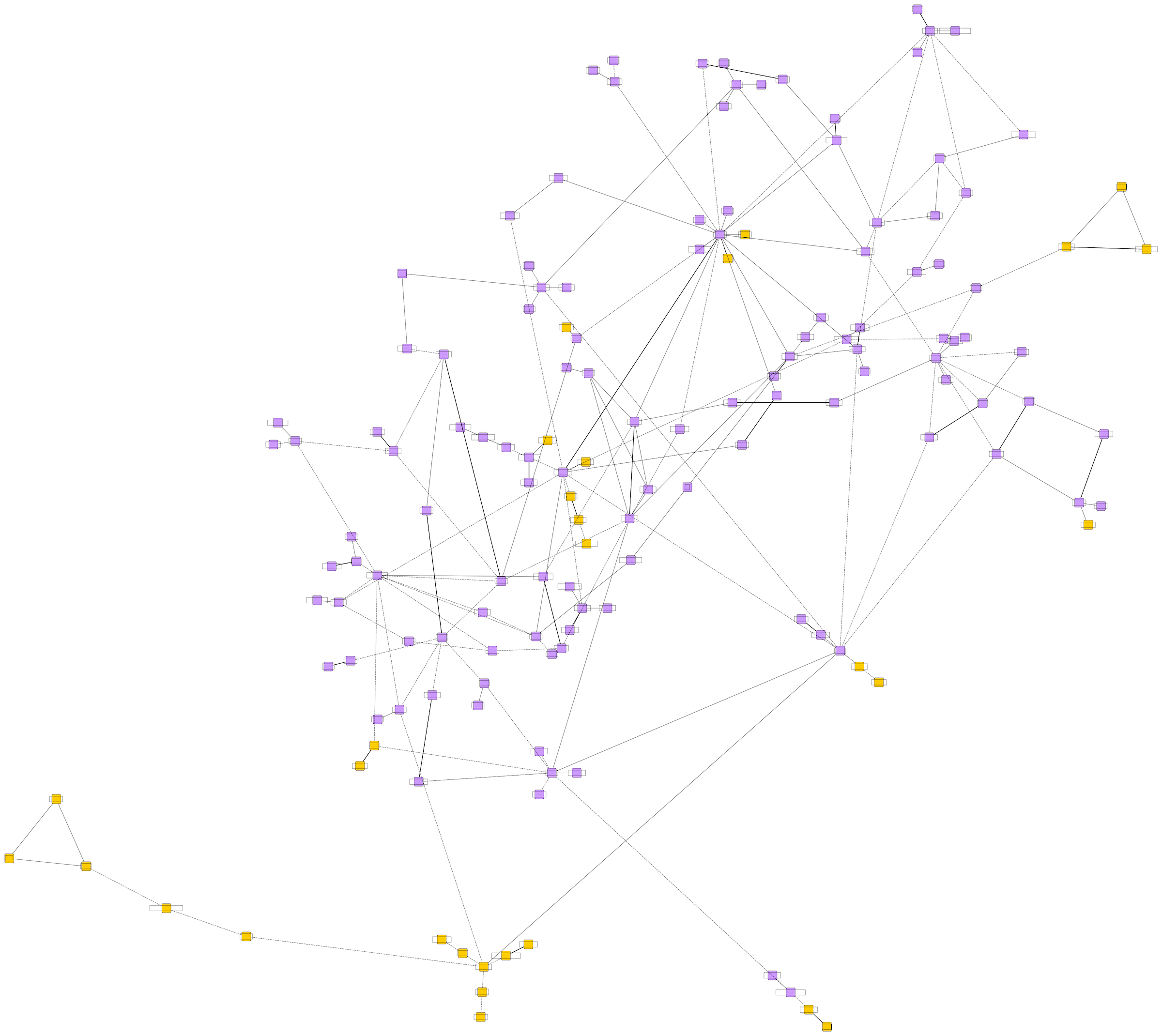
The 2D visualizations were great, but they had some drawbacks. Clusters of relationships involving three or more people were difficult to visualize when flattened out. Nodes that would otherwise be just one or two connections away from each other could end up on opposite sides of the graph just because of space constraints.
A friend helped me find the Graphia app (also available on Windows & Mac) to convert the 2D GraphML files I’d created in yEd into a 3D graph.
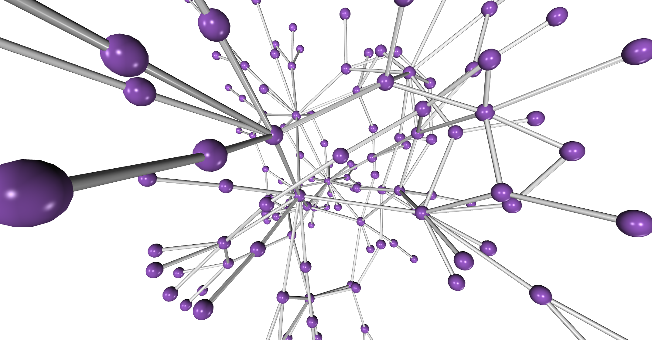
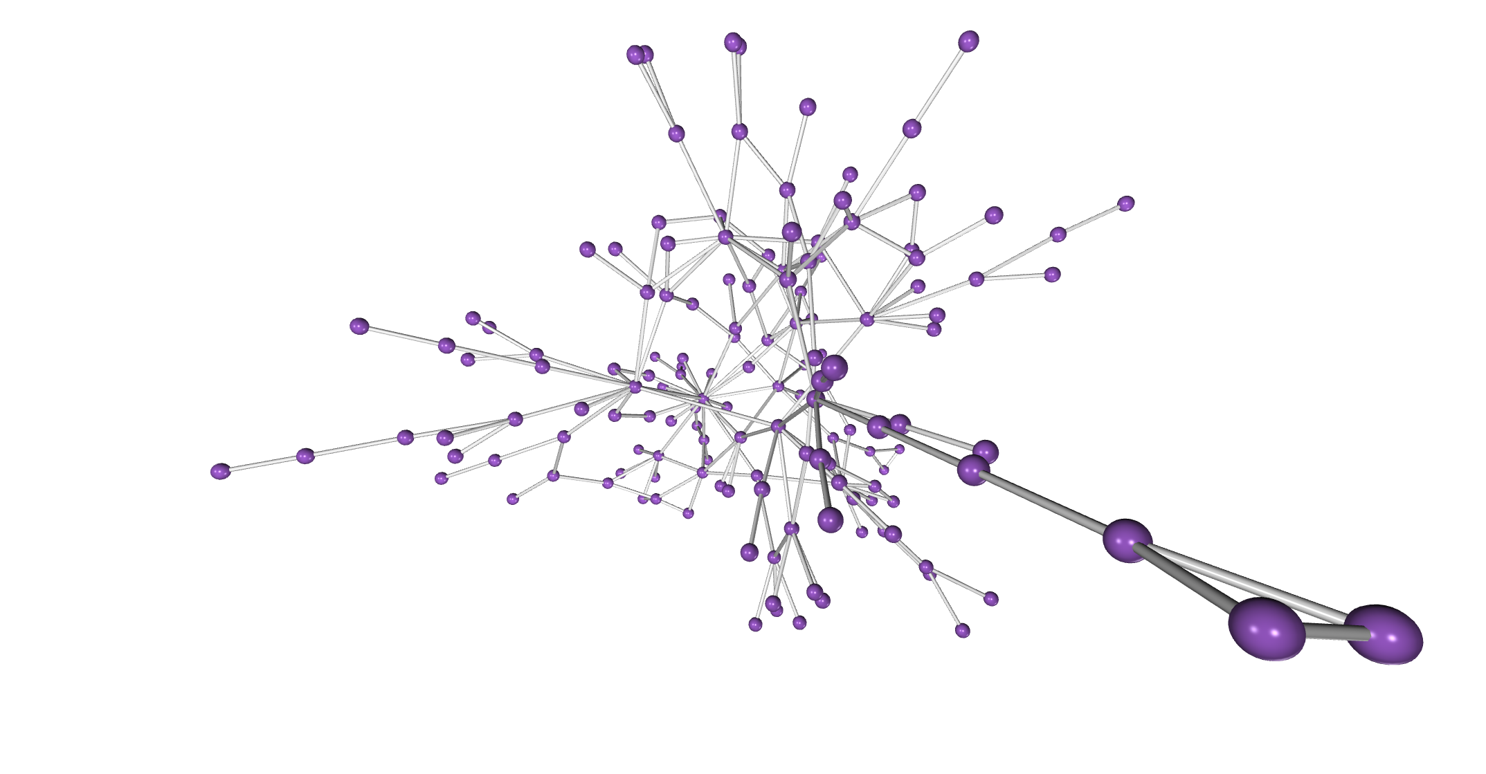
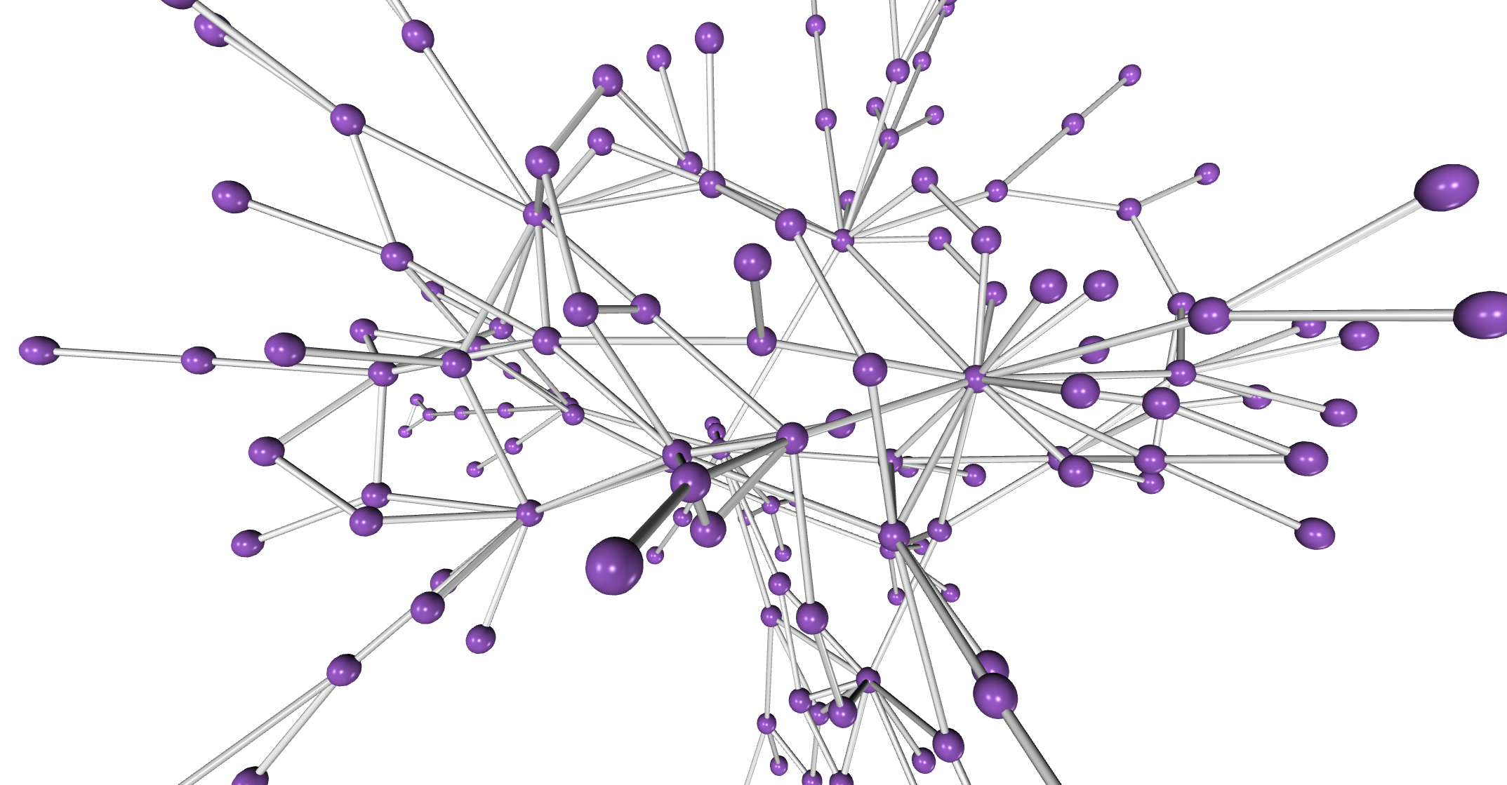
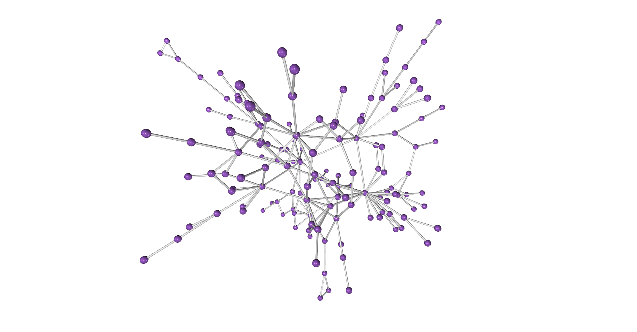
You can see the 3D polycule in action below.
Some points of the graph branch out and end, but there’s no doubt that other branches connect to more people and communities that my friends and I simply don’t know well enough. This was never meant to be a comprehensive record, just an exercise in curiosity. I’ll continue to keep the graph updated from time to time, whenever I remember. Who knows how big it will have gotten in another year?
If you ever decide to graph or map your polycule this way, you may find that it’s a small world out there. And if your friends are a bunch of delightful sluts like mine, it’ll just keep getting smaller.
The title of this blog post is a reference to this viral tweet and this article. I suppose now, like other things that start as a joke and end up getting used in earnest, the next logical step would be for me to make a polycule onboarding presentation like this one.
If you’re curious, you can read more about my polyamorous life or my most polyamorous moments.